
Propulsion modelling: More efficient ship propulsion through statistical modelling and control.
- Modelling
- >
- Implementation
- >
- Regression
Regressional modelsOverviewRegression Models Note Two new sections have been added: PCA and regression using Gaussian Mixture Models. The code tarball has also been updated accordingly. IntroductionThis page contains the data and source code used to generate the models, results, and plots used in the articles: Statistical Modelling for Ship Propulsion Efficiency and A Machine-Learning Approach to Predict Main Energy Consumption under Realistic Operational Conditions. However some of the results for the second article are found under the dynamical model section. Source codeThe source code and pre-processed data can be downloaded here. The pre-processing of the data implies outlier removal and feature extraction. The raw unprocessed data can be downloaded under the data section.
The models are implemented in ann_model.py, gp_model.py, gmm_model.py. Three corresponding files, visualize_ann_models.py, visualize_gp_models.py, and visualize_gmm_models.py, are for visualizing the results. This separation is done, as not to include any Matplotlib libraries in the modelling files. The file common.py contains functions used by both by most files. Data explorationPrincipal Component AnalysisTo examine how the signals are correlated one can plot the samples on the Principal Components axes. To execute the PCA plots from the ipython environment:
In[1]: execfile('pca_plot.py')
This should result in several plots. The singular values for the components: 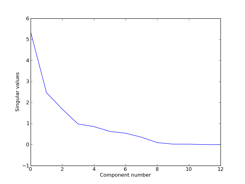
And the direction of the unit vectors in two dimensions (the two most important principal components): 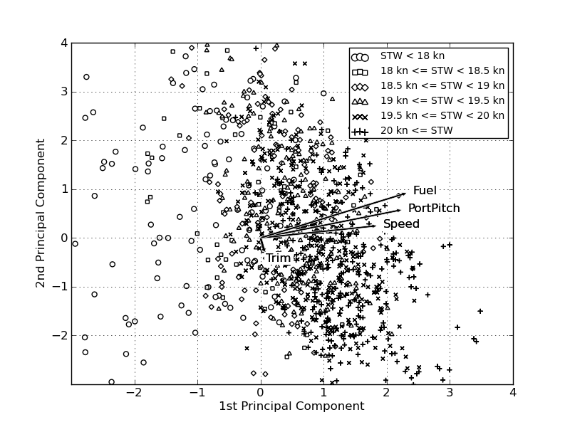
Artificial Neural Networks for regressionTraining the ANN models are not nearly as a time consuming process as training the GP models. The job is handled by a method, which trains all the models and saves them in one pickle file. The training is done in parallel if possible - this will depend on the number of processors on the machine, python version amongst other factors. Here is a an example of how 10 cross validation model can be trained, and a final network, with best found weight decay:
In [1]: execfile('ann_model.py')
In [2]: train('ann_models_fuel_rows.pkl', set_type='rows', target='Fuel')
The code for examining ANN models is located in visualize_ann_models.py. Here the method examine_ann_results can be used to examine and visualize the results. It will generate several plots used in the article, and also give the final model's and cross-validation models' performance on the test set. If you are located in the code folder, and in the IPython Pylab environment, then you could plot the ANN results like this:
In [1]: execfile('visualize_ann_models.py')
In [2]: examine_ann_results('../models/annmodel/ann_models_speed_trips.pkl', set_type='trips')
If successful this should generate seven plots. For example the output for the speed predictions for the test set: 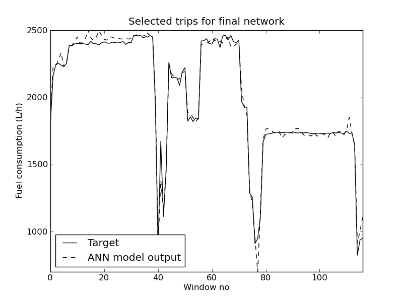
The plot contains so many trips, that it is impossible to see the difference between the predictions and target values, but it is possible to zoom in on areas in Matplotlib to investigate them closer. It is also possible to visualize the efficiency using a speed and a fuel model:
In [3]: visualize_ann_3d('../models/annmodel/ann_models_speed_trips.pkl', \
        '../models/annmodel/ann_models_fuel_trips.pkl', set_type='trips')
However one should be very careful interpreting these plots, as they don't give any indication of the precision of the results. Also there are many feature inputs that have been set in these plots, so these plots are of limited use. 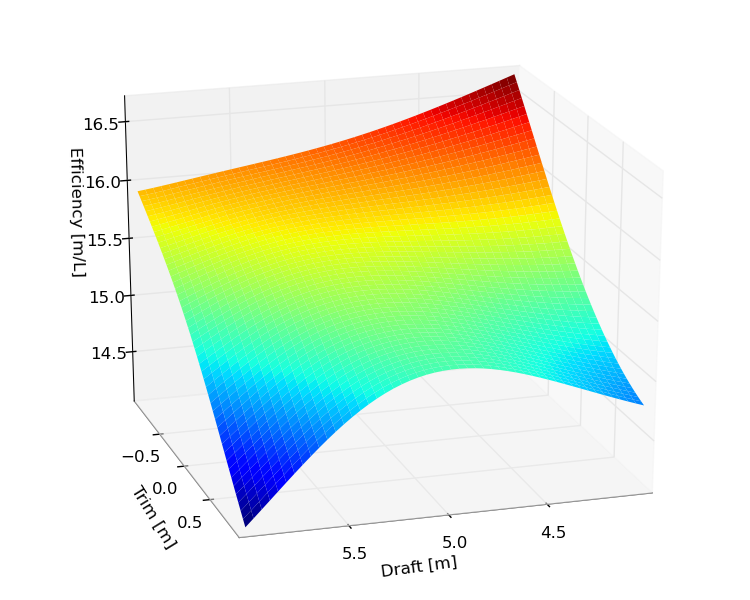
Estimating the needed training set sizeThe script ANN_training_set_size.py can be used to estimate how the size of the training set affects the performance of the models. The script will train an ANN with a given weight decay with different sizes of training sets. By default a fuel model is created using the data split trip-wise is used. The script will produce a plot as an output. 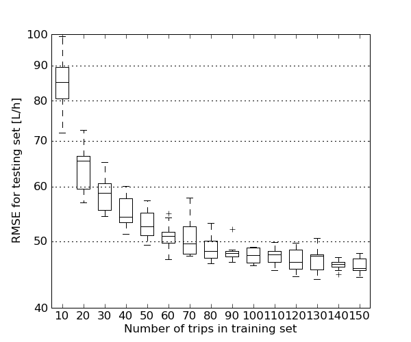
Examine the effect of removing featuresA way of study the effect of features on the performance of the model, is to remove them from the input, and look at the performance deterioration. A network with no inputs derived from the level measurement devices can be trained as follows:
execfile('ann_model.py')
data=load_train_valid_data(set_type='trips')
train('ann_models_fuel_trips_no_level.pkl', set_type='trips', \
                columns_to_use=get_columns_to_use_no_level(data))
The method get_columns_to_use_no_levels(data) returns the columns numbers that contain the no level data. It needs a reference to a data set, because it uses it to find the column numbers. Another function also exists, get_columns_to_use_only_pitch(data), which only returns the the column numbers for the port and starboard pitches. Gaussian Processes for regressionThe executable train_gp_model.py will create one GP model, which is stored in a Python pickle file. It uses cross validation, so the user has to specify its setup. So if a 10 fold cross validation is to be done, the program needs to be executed 10 times. If the dataset is large, then the GP training will take some time - maybe days. The models given in the tarball have been trained on several machines with large memory. Here is an 10-fold cross validation example, using the data set split by rows:
python train_gp_model.py --set_type 'rows' --target Fuel --cv_K 10 --cv_k 0 \
         --filename_prefix gp_fuel_rows
This will create a GP model stored in a file called gp_fuel_rows_10_0.pkl. To create all the 10 models the program has to be executed 10 times, using the correct values for --cv_k. Because of the computational requirements of the GP, it would be an advantage if the user has access to a cluster. Then a job could be submitted for each value of k. It is also possible to examine each individual GP model, using the method examine_and_plot_gp_model from visualize_gp_models.py. This is also the method that plots the GP output for the selected trips. The window size is three minutes. The plot contrains three selected trips. 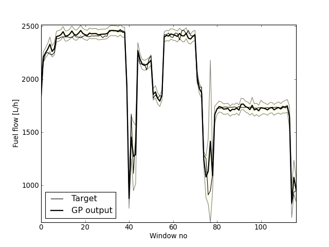
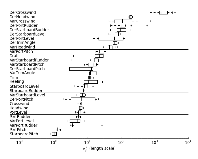
To plot the ARD for the inputs to the GP model, use plot_cv_ard. It takes a list of GP model filenames and generates a plot similar to this:
In [3]: plot_cv_ard(filename_itr('../models/gpmodel/gp_fuel_trips_10_'))
Gaussian Mixture Models for regressionThe code for training the GMM is called train_gmm_model.py and the code for visualizing the results is called vizualize_gmm_model.py. For example to train a GMM model run the following commands:
In [1]: execfile('gmm_model.py')
In [2]: train_gmm(K_start=2, K_end=20, pkl_filename=None, cv_K=10, cv_k=None, \
        max_iter=1000, runs=1, cluster_init='kmeans', delta_stop=0.1, \
        data_set='trips')
The method returns a package of GMM models. The GMM models are stored in the file gmm_regression_trip_model.pkl in the models folder. To plot the BIC score, use the following command:
In [3]: execfile('visualize_gmm_models.py')
In [4]: plot_bic(get_filenames(list_dir='../models', fn_exp='regk*.pkl'))
This will calculate the BIC score for all the models in the ten model packages. And give the following plot. 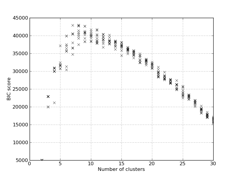
It will also report the model with the best BIC score: Best BIC score 42964.617269, K=8, index=6 from model pack 0 When using the GMM for predicting the speed and fuel, the conditional distribution is used. So we find the speed and fuel given the inputs. This is done in the speed_fuel_cond method, and we can find the performance for K=13 on the test set using:
In [6]: res, targ, prob, ll = speed_fuel_cond('../models/regk_0.pkl',\
            model_idx=6, set_type='test')
...
RMSE for the speed was found to be 0.42 kn
RMSE for the main fuel consumtion was found to be 51.84 L/h
Removing features can be achieved by using the marginalization parameter. As an experiment all features derived from the sea surface level measurements are removed, to see how it will affect the performance:
In [7]: res, targ, prob, ll = speed_fuel_cond('../models/regk_0.pkl',\
            model_idx=6, set_type='test', marg_names=get_names_to_remove_no_level())
...
RMSE for the speed was found to be 0.49 kn
RMSE for the main fuel consumtion was found to be 65.77 L/h
And it we remove all but the port and starboard propeller pitches:
In []: no_pitch_names = [n for n in gmm_model_pack['names']]
In []: no_pitch_names.remove('PortPitch'); all_names.remove('StarboardPitch')
In []: no_pitch_names.remove('Speed'); all_names.remove('Fuel')
In []: res, targ, prob, ll = speed_fuel_cond('../models/regk_0.pkl',\
         model_idx=6, set_type='test', marg_names=no_pitch_names)
...
RMSE for the speed was found to be 1.21 kn
RMSE for the main fuel consumtion was found to be 109.99 L/h
To plot the residual SE errors versus the probability cutoff then run the following commands:
figure()
gmm_model_pack = cPickle.load(open('../models/regk_0.pkl'))
train_res = speed_fuel_cond(gmm_model_pack, model_idx=6, set_type='train')
test_res = speed_fuel_cond(gmm_model_pack, model_idx=6, set_type='test')
speed_fuel_prob_rmse_plot(train_res, test_res)
The resulting plot should look like this: 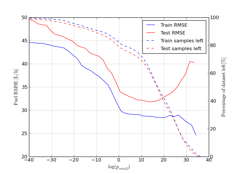
Here we have iterated over the whole range of cutoff values for the probability for each sample. At high cutoff values little data is left, and the RMSE becomes more noisy. It is also interesting to note that the RMSE of the test set becomes considerably worse towards the end. The reason for this, is likely overfitting of the the components responsible for the high pdf values. To plot the selected trips run the following command: selected_trips_cond(gmm_model_pack, model_idx=6) Which should produce a plot like this: 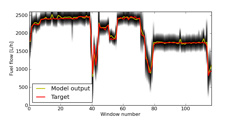
The pdf for each prediction is returned by the GMM, and this is why this kind of plot has been used to illustrate this. A method exist for investigating pdf the marginal plots in two dimensions. It can also plot the sample as scatter points, and the ellipses of the Guassian components in the mixture in the same plots. Here we plot two marginal plots: plot_marg(gmm_model_pack, model_idx=9, draw_ellipses=True, draw_scatter=True, sel_ax=[0,2]) plot_marg(gmm_model_pack, model_idx=9, draw_ellipses=True, draw_scatter=True, sel_ax=[0,25]) 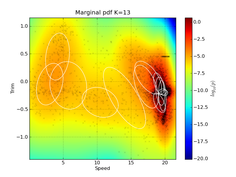
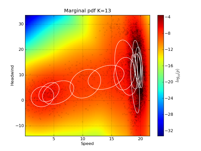
Note that the ellipses representing the Gaussian Mixture components do not visualize their mixing coefficient values. So some of the components might actually have very low mixing coefficients, even if they are drawn on the plot. The indexes of the signal can be found by investigating the names keyword in the gmm_model_package: In[20]: for i, name in enumerate(gmm_model_pack['names']): ....: print i, name ....: 0 Speed 1 Fuel 2 Trim 3 PortPitch ... Feature importanceIt is quite easy to remove features from the GMM using marginalization - there is no need for retraining the model. We can make a test to see how removing features from the input will affect the performance of the model. The method plot_rmse_matrix will plot a grid of the RMSE values while removing pairs of features. The names of the removed features are given on the x and y axis. In the case where the feature names are the same, then only that one feature is removed. Here is an example where only 1000 samples are used from the test set: plot_rmse_matrix(gmm_model_pack, model_idx=9, set_type='test', max_samples=1000) 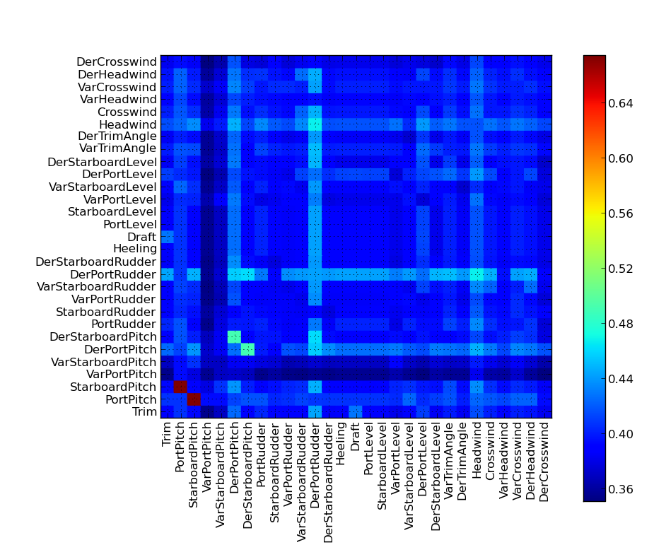
It can take some time to do the calculation, because there are so many feature pairs. It is interesting to note how the performance does not suffer considerably when only removing one of the propeller pitches, but when we remove both, the performance becomes the worst obtained for this example. The reason is that the two features carry redundant information about each other; they are very correlated. So the system can easily perform well without one of them. Return to Top |
|||||||||||||||||||||||


